The Importance of Color in Jewelry Packaging
When it comes to jewelry packaging, color is an important consideration that should not be overlooked. Research has shown that color can significantly impact a customer's perception of a product, and ultimately influence their purchasing decision.
One of the key factors to consider when choosing a color for your jewelry packaging is your target audience. Different colors can evoke different emotions and have different cultural associations, so it's important to choose a color that resonates with your customers.
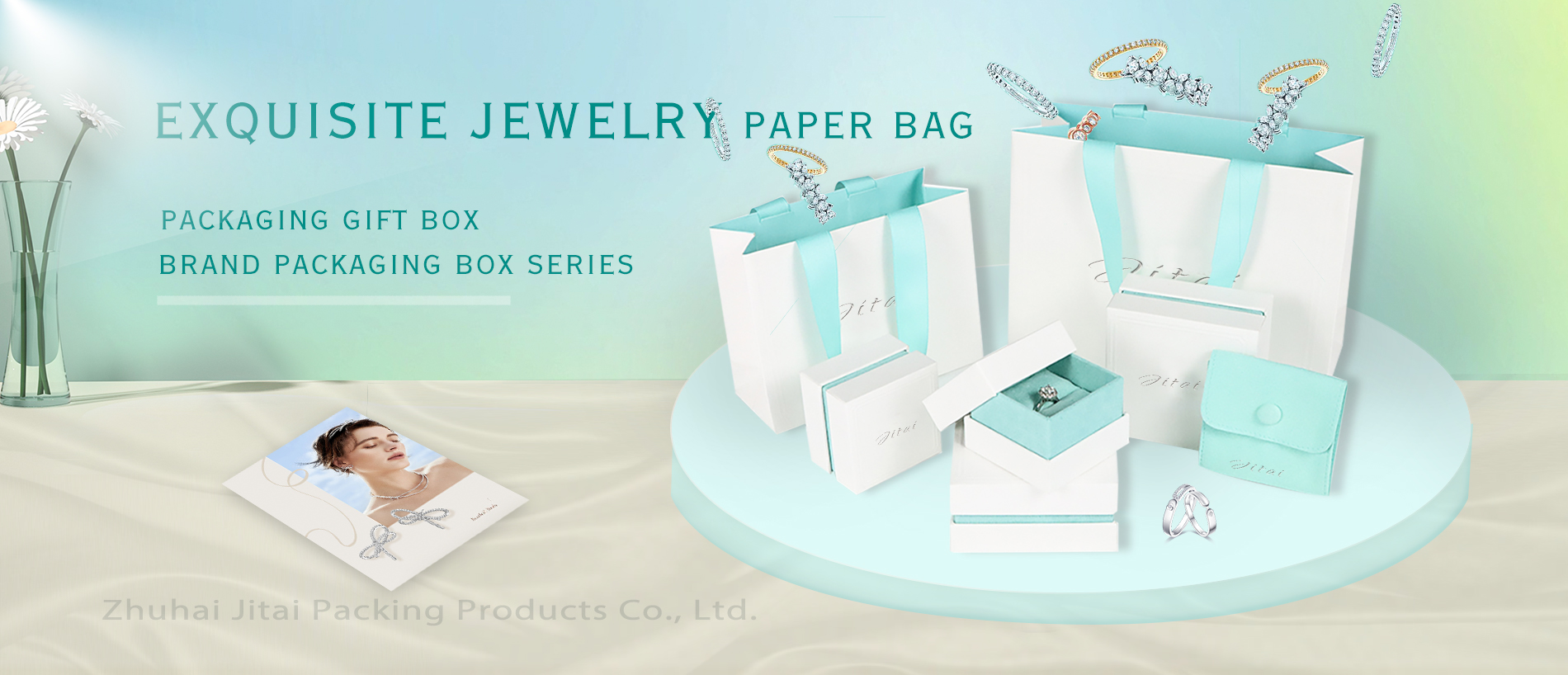
For example, if you're targeting a luxury market, you may want to consider using black, gold, or silver packaging to convey elegance and sophistication. On the other hand, if you're targeting a younger, more playful audience, you may want to use brighter colors like pink or blue to convey a sense of fun and energy.
Another important consideration is the color of your jewelry itself. You want your packaging to complement your jewelry and enhance its beauty, so it's important to choose a color that will not clash with your jewelry or detract from its appeal.
In addition to these factors, it's also important to consider the practical aspects of color in jewelry packaging. For example, lighter colors may show dirt and wear more easily than darker colors, so you may want to choose a darker color that will hide wear and tear over time.
Overall, color is an important consideration when it comes to jewelry packaging. By choosing the right color for your target audience and your jewelry, you can enhance your product's appeal and increase your chances of success.
Color is an important consideration when it comes to jewelry packaging. The right color can significantly impact a customer's perception of a product and ultimately influence their purchasing decision. While there are many factors to consider when choosing a color for your jewelry packaging, the most important consideration is your target audience.
Different colors can evoke different emotions and have different cultural associations, so it's important to choose a color that resonates with your customers. For example, if you're targeting a luxury market, you may want to consider using black, gold, or silver packaging to convey elegance and sophistication. On the other hand, if you're targeting a younger, more playful audience, you may want to use brighter colors like pink or blue to convey a sense of fun and energy.
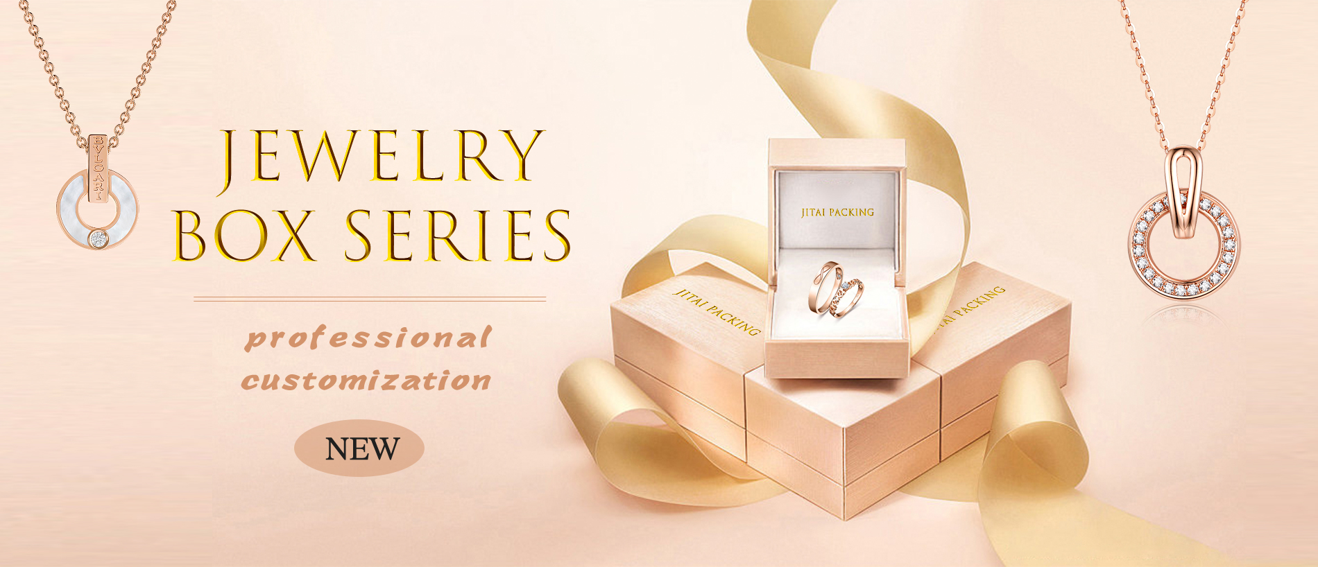
In addition to considering your target audience, it's also important to consider the color of your jewelry itself. You want your packaging to complement your jewelry and enhance its beauty, so it's important to choose a color that will not clash with your jewelry or detract from its appeal. For example, if you're selling jewelry with warm tones like gold or rose gold, you may want to choose a packaging color with warm undertones like brown or burgundy.
Practical considerations are also important when it comes to color in jewelry packaging. For example, lighter colors may show dirt and wear more easily than darker colors, so you may want to choose a darker color that will hide wear and tear over time. If you're selling jewelry that is delicate or prone to scratching, you may want to consider using a darker color that will make any scratches or imperfections less noticeable.
When choosing a color for your jewelry packaging, it's important to consider all of these factors to ensure that you are making the right choice for your product and your target audience. By choosing the right color, you can enhance your product's appeal and increase your chances of success.


